Given a vibration signal, an engineer may know how to do some exploratory analysis in the time or frequency domain (see Vibration Analysis Basics), but this requires a human to manually look at the signal and do their own analysis. So what happens when you are trying to monitor vibration over a long period of time and compare many different signals?
You need to be able to quantify the vibration signals into a handful of metrics, then track and compare those metrics. Analyzing the trends of these metrics would inform maintenance decisions for condition-based or predictive maintenance (see Different Data Driven Maintenance Strategies).
In this article I'll use some real vibration data from a bearing in normal and fault conditions to quantify it into the following 12 different vibration metrics to aid our analysis and allow for long-term monitoring:
- Acceleration Peak
- Acceleration RMS
- Crest Factor
- Standard Deviation of Acceleration
- Velocity RMS
- Displacement RMS
- Peak Frequency
- Acceleration RMS below 65 Hz
- Acceleration RMS from 65 to 300 Hz
- Acceleration RMS above 300 Hz
- Peak Pseudo Velocity
- Frequency of Peak Pseudo Velocity
I'll explain how each metric is calculated, and what it is most helpful for. All the source code that generated the plots is embedded at the end of the article to see exactly the way these metrics were calculated. And it can also be downloaded and applied to your own data. The plots will also be presented with Plotly which allows you to interact with the data/plot right here in the blog article. You can zoom, turn on/off different lines, scroll along the axes, toggle the nearest data point with your cursor, even export an image right from the browser - enjoy them!
This post is long, so in addition to using the list of metrics above that links directly into where we discuss each metric, the following list will link into more higher level discussion areas:
- Bearing Vibration Data
- Time Domain Analysis
- Frequency Domain Analysis
- Summary of All Metrics
- How to Calculate On Your Own (For Free)
- Conclusion & Additional Resources
We also ran a webinar and Q&A session on this topic that aligns nicely with this blog post and answers some great questions on the best metrics for calculating impact related accelerations, software recommendations, and more. Check it out here:

Bearing Vibration Data
Data was downloaded from the Case Western Reserve Bearing Data Center where they did some seeded fault testing and shared the data. This data can be downloaded here. An overview of the procedure is here.
They have a LOT of data on their site, but for simplicity we will look at 4 data files:
- Normal
- Fan End Fault, Inner Race
- Fault_007
- Fault_014
- Fault_007
All of these were when the motor was running at approximately 1772 RPM (29.5 Hz). The numbers in the fault file names signify the fault diameter in thousands of an inch. For example Fault_014 is a fan end bearing fault in the inner race measuring 0.014" in diameter. A CSV of the file can be downloaded here. Now let's see the data!
 The plot above is the full 10 seconds of data we'll analyze throughout the rest of the article. But each test was sampled at 12,000 Hz so there are 480,000 data points there.
Let's look at an interactive plot of the 0.25 second with the "peakiest" data. Remember, you can zoom around in this plot and turn on/off signals by clicking in the legend!
Time Domain Analysis
Now let's calculate some metrics to help us quantify and compare these vibration signals! These would be vibration metrics to monitor over time for condition-based maintenance.
Acceleration Peak, RMS, Crest Factor & Standard Deviation
Let me give you the metrics first, then explain them!
| Data Set | Acceleration Peak (g) | Acceleration RMS (g) | Crest Factor | Standard Deviation (g) |
|---|---|---|---|---|
| Fault_021 | 1.038 | 0.199 | 5.222 | 0.198 |
| Fault_014 | 1.339 | 0.158 | 8.484 | 0.158 |
| Fault_007 | 0.650 | 0.121 | 5.361 | 0.121 |
| Normal | 0.269 | 0.066 | 4.081 | 0.065 |
Peak Acceleration
The easiest metric to see and calculate is the acceleration peak. The only thing "tricky" here is to first find the absolute values of the data, then grab the peak from there so we don't miss a significant negative acceleration.
𝑝𝑒𝑎𝑘=𝑚𝑎𝑥(|𝑎|)
Peak acceleration may be easy, but it is often very misleading. And you can see in the table above that although there is some correlation between the significance of the fault and the peak acceleration, it isn't a perfect correlation. Peak acceleration values can be too dependent on a bit of chance with how the sampling lines up with the data. Meaning when you are comparing multiple signals to each other, any difference in sample rate or low-pass filters will make the comparison between the peak accelerations inappropriate and even more misleading than normal.
So if you are going to use peak acceleration in your health monitoring, proceed with caution!
RMS Acceleration
RMS is the square root of the mean of squares. It is a very easy calculation, also: square every acceleration value, get the mean of all of these, then take the square root of that!
 RMS is by far my preference over peak because it is independent of the sample rate and it will more accurately let you compare the vibration levels of two signals. RMS is also more likely to correlate to the vibration energy, but that energy determination is most closely tied to velocity RMS, not acceleration - but we'll get to that later! Another nice thing about RMS (which we'll cover later) is that it can be calculated from the power spectral density of a signal.
In general, acceleration RMS is very popular and a useful metric for vibration health monitoring.
Crest Factor
Crest factor is simply the ratio of the peak acceleration to the RMS acceleration, so it is unitless which is always nice. It defines how "peaky" a signal is. A square wave could have a crest factor of 1 whereas a signal with occasional shock events may have a very high crest factor. As crest factor increases, it tends to be an indicator of bearing failure, but as we can tell in our four signals, this isn't an end-all metric (because of the issues with peak acceleration).
Tracked over time (important to look at the trend, not individual values) for vibration health monitoring, crest factor can be an early indicator of wear.
Standard Deviation
Standard deviation is a statistical metric defining the amount of variation in the signal. About 68% of all values will fall within 1 standard deviation of the mean. Notice how closely it matches up with the RMS values though! This is something I only learned recently and I think it is so cool! There are a few nice things about standard deviation now knowing that it is effectively the same number as RMS:
- Independent of DC bias
- Easy to calculate
- Easy to conceptualize
The fact that standard deviation is independent of DC bias in my mind is super valuable when measuring and monitoring vibration - it is effectively an AC coupled version of RMS acceleration.
Compare Stats for a Pure Sinusoidal Signal
To demonstrate the power of standard deviation, let's build a pure 1g sine wave with a 7 Hz frequency. Now we'll sample this same/common signal in 4 ways:
- 100 Hz sample rate
- 29 Hz sample rate
- 29 Hz sample rate, and add a 1g bias
- 15 Hz sample rate
Here's a plot of 2 seconds worth of this data:
Now let's calculate the metrics for this exact same signal, but with 4 different sampling characteristics:
| Data Set | Acceleration Peak (g) | Acceleration RMS (g) | Crest Factor | Standard Deviation (g) |
|---|---|---|---|---|
| 100 Hz, 0g Bias | 1.000 | 0.705 | 1.418 | 0.707 |
| 29 Hz, 0g Bias | 0.999 | 0.701 | 1.424 | 0.707 |
| 29 Hz, 1g Bias | 1.999 | 1.221 | 1.636 | 0.707 |
| 15 Hz, 0g Bias | 0.995 | 0.696 | 1.430 | 0.707 |
Notice a few things:
- Lower sampled data won't perfectly catch the peak. This becomes more egregious in real world data that has many vibration frequencies
- A DC Bias ruins the RMS metric. The DC offset due to gravity or from other conditions in the data acquisition system translates into the RMS calculation.
- RMS acceleration values don't perfectly line up with the 0.707 we'd expect. A pure sine wave should have RMS values equal to 0.707*peak. But our data set isn't large enough to make this come out accurately. We would need to have 50 seconds of data to have all the different sampling come out with the same RMS value.
- Standard deviation doesn't care about the DC bias and accurately captures the expected RMS value of 0.707. Standard deviation is a robust way to get the AC coupled RMS value of acceleration.
Integrate Acceleration for Velocity & Displacement
Now let's integrate our acceleration signal to see the velocity (proportional to energy) and displacement (very intuitive to understand!). There are two ways to do this calculation: the first is in the time domain that I'll explain now and the second is in the frequency domain which we'll do next.
One note here on the integrations: regardless of how we do it, we need to pay attention to units. We have acceleration in 'g' and I want to see velocity and displacement as a function of inches (I'm sorry, I'm still not perfectly calibrated to SI units!). This is the conversion:
To integrate the data in the time domain we can use a cumulative trapezoidal numerical integration method (see MATLAB's cumtrapz, and SciPy's cumtrapz) which loops through every data point and cumulatively adds the area under the curve. This works very well with a noise-free, perfect sine wave; but those don't exist in the real world. And these errors become more egregious when we do the double integral to get displacement.
So we need to do a few things to make this calculation come out right, and do these before & after each integration step.
- Apply a bandpass filter (see more on filtering)
- Force the data to start and end at 0 with a taper (I'll use a Tukey window)
Integrate a Simple 7 Hz Sine Wave
To see the impact of the filters and taper, let's go back to our 7 Hz sine wave. We'll do the double integration on the pure 7 Hz signal as well as one where we added noise to it. First, here is the time domain data of the acceleration.
Before we look at the results in the time domain, let's go back to the basics with our simple harmonic motion equations (see Mide's convenient calculator). We know that a 7 Hz, 1g sine wave should have:
- Velocity peak = 223 mm/s or 8.8 in/s
- Displacement peak = 5 mm or 0.2 in
Now let's see the results of the velocity integration. Remember, these are Plotly plots so they are interactive. You can hide a line by simply clicking it in the legend. Without the taper you can see that our velocity amplitude is correct, but there is a DC offset as if it was already traveling at some known velocity. And the filters aren't needed for the pure sine wave, but for the signal where noise was added, you can clearly see the filters in addition to the taper make the results line up nicely with the pure signal. You can still see the effect of that noise we added, but much of the noise was at higher frequencies which is less impactful on the integrated velocity (lower frequencies are more important).
Now let's see the results of the displacement integration. Watch out! Because of the offset that exists in the velocity integration without a taper, when we integrate again for displacement, this offset results in a runaway displacement value. Now we can see, too, that there had been a slight trend in velocity values even with the taper applied that results in a significant error in the displacement. By applying the tapers & filters, our resulting displacement peaks match the 0.2 in/s we'd expect from our simple harmonic motion equations.
Back to the Bearing Data
Now that we've shown the importance of applying filters and tapers before/after integrating the acceleration data, let's do the integrations on our bearing data. Note that we did the integration and later calculation on the full signal but will only plot 0.25 seconds.
Something that jumps out and surprises me is that the normal bearing displayed quite a bit higher velocity and displacement levels - yet it had much lower acceleration levels! Why is that?
When integrating data, the lower frequencies dominate the resulting integration. And we'll see in the next section that the normal bearing has a lot of lower frequency content which the faulty bearings do not have.
Now that we have it in the time domain we can perform the RMS calculation like we had done before. Here are the results:
| Data Set | Velocity RMS (in/s) | Displacement RMS (in) |
|---|---|---|
| Fault_021 | 0.0080 | 0.000054 |
| Fault_014 | 0.0084 | 0.000010 |
| Fault_007 | 0.0067 | 0.000011 |
| Normal | 0.0264 | 0.000083 |
The Importance of Velocity RMS
All in all though, these velocity and displacement values are quite low. But how do we know what "low" is? There is an ISO standard, 10816, that defines vibration severity for machines:
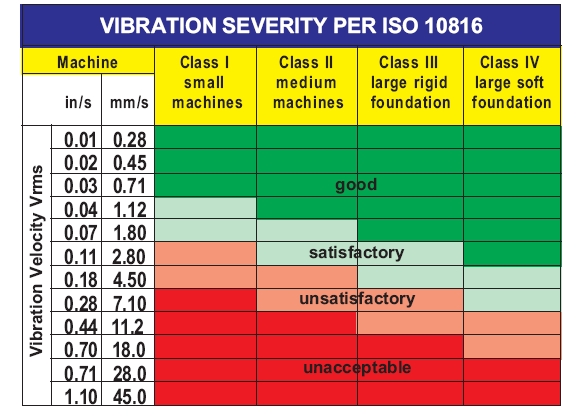
There is no ISO standard for vibration severity in terms of acceleration levels - why is that? Velocity corresponds to energy; high or low frequencies are weighted the same in terms of energy. But when looking at acceleration values, the higher frequency content dominates, and on the flip side, when looking at displacement, the low frequency content dominates.
Because velocity corresponds to energy, this tends to be the primary metric tracked over time for vibration health monitoring for condition-based and predictive maintenance.
The Importance of Displacement RMS
In the world of mechanical systems, noticeably displacements only occur at very low frequencies which means the displacement values will often be very low and of little use to track. Still, they are helpful to look at because these values are intuitively understood by anyone. In rotating equipment, displacement is a great indicator of unbalance because it will result in significant displacements that occur at the shaft rotating frequency.
Although intuitively understood, displacement RMS tends to be very low and of no interest for most vibration health monitoring applications. The primary exception is in rotating equipment where unbalance is a concern can cause significant displacement values.
Frequency Domain Analysis
We are going to spend most of our time when doing frequency analysis by looking at the power spectral density, not the FFT. Why?
PSDs are Better Than FFTs, Here's Why
Power spectral densities are better than FFTs for vibration analysis. Here are the primary reasons why (and I've discussed this before, see Why the PSD is Gold Standard for Vibration Analysis):
- Results are independent of sample length
- The frequency resolution or bin width can be explicitly defined
- Easily integrate for velocity or displacement
- Easily calculate the RMS values straight from the PSD
There is only one thing about a FFT that PSDs don't have: phase angle. PSDs are the squared values of the FFT normalized to the bin width which means that the complex values (phase angle) are gone. But there is a function called a cross power spectral density which can still provide the phase of a system with a known vibration and measured response. This is useful for determining a transfer function of a vibration isolator or other system.
But again, PSDs are better - let's demonstrate this! First let's look at a fabricated signal that has two contributing sine waves each with a 1g amplitude but different frequencies. Note that the RMS value of this signal is exactly 1g.
Now we'll compute the FFT of the full 10 second signal. The results look as we'd expect!
By doing the FFT of a signal of 10 seconds, our two sine waves were able to fully complete all cycles. But what happens if we do the FFT of different lengths where they can't complete an integer number of cycles? Bad things happen...
What happened? We had frequency leakage (see Leakage in FFTs Explained) between different frequency bins which gives us that super ugly response and one that doesn't have a peak where I'd expect at 1g. We can improve this by applying window functions (like discussed before when integrating) but that can sometimes actually make the results look worse when it is getting rid of data we actually need. So what can we do?
Power Spectral Density (PSD) to the rescue! The PSD is computed by:
- Segmenting the time domain data into a series of segments. The user can define the segment length which will be inversely proportional to the resulting frequency bin width (a bunch of 1 second long segments will give a 1 Hz bin, a bunch of 2 second long segments will give a 0.5 Hz bin).
- Then a window is applied to each segment while also overlapping all segments so that we aren't filtering anything away.
- Compute a FFT on each windowed and overlapped segment
- Square the results of the FFT
- Average all the squared FFTs (one for each segment)
- Normalize (divide) by the frequency bin width in Hz
Voila, a PSD is calculated with the units of g2/Hz. Here's the resulting PSD for the same signal as computed for the FFT and the same recording lengths. There are three lines there but they are virtually identical!
Now the units may be confusing. We know we had a 1g 7 Hz and 13 Hz signal, but how can I tell this from the PSD? This table shows the five PSD values around the 7 Hz peak. We'll compute the RMS values by taking these values, computing a cumulative sum, multiplying by the bin width (1 Hz in this case), and taking the square root.
There's that 0.707 number we know to expect for the RMS of a 1g signal, pretty cool!
| Frequency (Hz) | PSD Value (g^2/Hz) | Cumulative Sum (g^2/Hz) | Multiply By Bin (g^2) | Square Root (g RMS) |
|---|---|---|---|---|
| 5.0 | 0.000 | 0.000 | 0.000 | 0.000 |
| 6.0 | 0.083 | 0.083 | 0.083 | 0.289 |
| 7.0 | 0.333 | 0.416 | 0.417 | 0.645 |
| 8.0 | 0.083 | 0.500 | 0.500 | 0.707 |
| 9.0 | 0.000 | 0.500 | 0.500 | 0.707 |
If you are still holding on hope that FFTs are useful... let's take a look at how egregiously bad they are with real world vibration that has many different frequencies in it. We'll go back to our bearing data and compare the results of a FFT for the first 0.125 seconds with a FFT for the full signal length.
What is most troubling is that the levels are different by several of orders of magnitude. Clearly you can't use a FFT to quantify a vibration environment. Here is the comparison now on the PSD though.
Much better! Hopefully I've put the FFT to rest. But I'm sure you'll want to see the FFT of the full set of bearing data, so here it is. Now I'm done with the FFT!

Power Spectral Density & Cumulative RMS
Now back to the beloved PSD. First, here's the comparison of the PSD with 1 Hz frequency bins:
There is a lot going on here! We'll clean this up further in a moment, but while we have the high resolution PSD, we can pull out some peak frequencies. If you zoom in, you can tell that all signals show a spike around 30 Hz which corresponds to the motor speed of 1772 RPM.
But this isn't the absolute peak frequency, so let's grab that and the corresponding maximum amplitude.
| Data Set | Peak Frequency (Hz) | Peak Amplitude (g^2/Hz) |
|---|---|---|
| Fault_021 | 3316.0 | 0.0018 |
| Fault_014 | 3237.0 | 0.0018 |
| Fault_007 | 1051.0 | 0.0006 |
| Normal | 90.0 | 0.0005 |
We won't use the peak amplitude, though, as one of our 12 metrics because this is better handled by looking at specific frequency ranges we'll do in a minute.
Peak Frequency
Tracking the peak frequency, though, is useful and we can see that the rising fault really pushes up the peak!
Changes in the peak frequency may mean that our structure is changing, the major exception, though, is if this peak frequency is occurring at what the surrounding environment is vibrating at, not necessarily our structure of interest.
RMS from PSD
As we briefly demonstrated with the simple signal that had two frequencies in it, the RMS levels can be determined straight from the PSD with this equation:
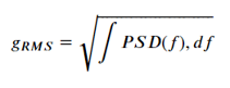
Let's demonstrate by quickly using the PSD just calculated, integrating, and taking the square root and compare to the values we calculated from the time domain.
| Data Set | RMS From PSD (g) | RMS From Time (g) | Error % |
|---|---|---|---|
| Fault_021 | 0.199 | 0.199 | -0.121 |
| Fault_014 | 0.157 | 0.158 | -0.348 |
| Fault_007 | 0.122 | 0.121 | 0.558 |
| Normal | 0.065 | 0.066 | -1.603 |
That is pretty spot on! This also let's us conveniently plot over the frequency range how the RMS builds. Again, this is all coming straight from the power spectral density!
In this view it is very obvious what frequency ranges contribute most to the overall RMS values. In the normal bearing there is a lot building early whereas in the faulty bearing the RMS acceleration all comes at high frequencies.
Another PSD Trick: Integration to Velocity & Displacement
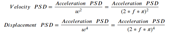
Yet another nice thing about the power spectral density is that integrating from acceleration to velocity and displacement is super easy and doesn't require messy filtering and applying tapers. The velocity PSD is simply the acceleration PSD divided by the angular frequency squared. To get to displacement, divide again by the angular frequency squared. Note that we need to pay attention to units again, especially because we have squared terms.
Here are the resulting PSDs of velocity and displacement:
And remember, now that we have a PSD we can easily calculate the cumulative RMS. So let's do that and compare to what we calculated earlier with the integrations in the time domain. But remember in the time domain we had to filter out the lower frequencies because they contributed to drift and error. We can do this again by simply disregarding the earlier frequencies and only doing the cumulative RMS calculation from 6 Hz on.
| Vel From PSD (in/s) | Vel From Time (in/s) | Disp From PSD (in) | Disp From Time (in) | Vel Error % | Disp Error % | |
|---|---|---|---|---|---|---|
| Fault_021 | 0.0086 | 0.0080 | 0.000054 | 0.000054 | 7.8 | -0.5 |
| Fault_014 | 0.0090 | 0.0084 | 0.000007 | 0.000010 | 7.2 | -26.3 |
| Fault_007 | 0.0069 | 0.0067 | 0.000010 | 0.000011 | 3.7 | -5.3 |
| Normal | 0.0272 | 0.0264 | 0.000087 | 0.000083 | 3.2 | 4.8 |
This shows that the two approaches have integration results within about 10% of each other (I'm not sure what's going on with the 14 mil fault signal. I think it's partially due to just how little low frequency content exists). So which approach is more correct?
Well... it depends. When you go the time domain route, it can be a little easier to see your integration is bad when it is "running away" from 0. So you can adjust the filters and repeat. But this can be computationally heavy. When you do it with the PSD you can readily see how the frequency content is impacting your results. But the results aren't necessarily as intuitive to understand. So both approaches are right! It's good to do this check between the two as I've done.
Octave Spaced PSD
I've hammered the point that the acceleration power spectral density maps directly to RMS which has some nice features, including that of being able to set logarithmically spaced frequency bins (while keeping the overall RMS levels accurate). We discussed this in our article How to Develop a Vibration Test Standard.
So let's define a 1/3 octave spaced power spectral density (every frequency bin is 2(1/3) greater than the last) of this bearing data.
This version of the power spectral density starts to make it easier to compare the four signals. Here it is especially obvious how much low frequency content the normal bearing has relative to the faulty ones. We may decide to track the the levels for each data point in the 1/3 octave but that is still 20 data points alone!
RMS within Specific Frequency Bands
In the interest of simplicity to let us track a more manageable number of metrics, we can make our frequency ranges even more coarse to monitor the RMS levels for just three ranges.
RMS Acceleration for Frequencies Below 65 Hz
This frequency range tends to be referred to as the rotor vibration range and will be dominated by the motor's RPM (divide that by 60 for Hz). Tracking RMS in this range may not tell you all that much about your system's health, but instead tell you more about the environment the system is in. The major exception is when something is not balanced.
Changing RMS levels at low frequency tends to be dominated by the environment, not necessarily the health of our component we're monitoring. But significant changes may be an indicator of unbalance and will require maintenance.
RMS Acceleration for Frequencies Between 65 Hz & 300 Hz
This frequency range tends to be referred to as the rotor harmonics frequency range and will be dominated by harmonics (multiples) of the motor's RPM. But significant changes can be an indicator of misalignment or mechanical looseness.
Significant changes in this mid-frequency range can be an indicator of misalignment or mechanical looseness.
RMS Acceleration for High Frequencies (Above 300 Hz)
While lower frequencies were dominated by more macro level changes, high frequencies are the best indicator at the inside of our system. Changes here will be a major factor of some cracking or damage within the system. If the high frequency signature changes, this means our structure itself changed. And we can see that from the bearing data. Of all the metrics we looked at, this is by far the most significant indicator of damage for our system.
Changes in high frequency RMS levels will be the most effective way of determining if the structural signature of our system changed. Said another way, the system is degrading and needs to be maintained before it catastrophically fails.
Peak Pseudo Velocity
Although peak pseudo velocity is the primary method for analyzing and quantifying a shock event (see Shock Analysis: Response Spectrums) it isn't often looked at for vibration monitoring. I think that's a mistake.
Before I discuss why, let's see the pseudo velocity spectrums for our four signals. These calculate how a system for a given/range of natural frequencies will respond to our vibration/shock signal input. Then it finds the worst case / peak velocity for that given natural frequency. Because it is velocity, this means it aligns most with energy.
From the spectrum we can pull out the peak amplitude and the corresponding frequency of that amplitude.
| Data Set | Peak PV (in/s) | Peak PV (Hz) |
|---|---|---|
| Fault_021 | 0.13 | 3251.0 |
| Fault_014 | 0.16 | 512.0 |
| Fault_007 | 0.09 | 161.3 |
| Normal | 0.41 | 90.5 |
Peak Pseudo Velocity
In some health monitoring environments you may be looking to track something that has a significant transient component to it (think a manufacturing robot picking something up). All the other metrics tend to work best for a steady state vibration. So tracking the peak pseudo velocity will best tell us if the energy in that transient event has changed.
Peak pseudo velocity will most closely track the energy content of a given transient event.
In our case where our bearings have no transients, this metric is admittedly not all that useful. But again, if your system has a transient - you NEED to be tracking this!
Frequency of Peak Pseudo Velocity
Now even if your system doesn't have a transient, tracking the frequency of the peak pseudo velocity tells us which frequency range is most damaging. And this is very much a helpful metric, even for vibration! You can see that there is a clear trend in our signals, as the fault increases the peak frequency is trending higher. We can also explicitly define the frequencies we want to compute the pseudo velocity for so it lets us have some control on the granularity of this.
The frequency of the peak pseudo velocity tells us which frequency range is most damaging in our environment. If this changes and trends higher, it can be another indicator of change in the structure of our system.
Summary of All 12 Vibration Monitoring Metrics
Ok, now let's look at all of our metrics in a table.
| Data Set | Normal | Fault_007 | Fault_014 | Fault_021 |
|---|---|---|---|---|
| Acceleration Peak (g) | 0.27 | 0.65 | 1.34 | 1.04 |
| Acceleration RMS (g) | 0.07 | 0.12 | 0.16 | 0.20 |
| Crest Factor | 4.08 | 5.36 | 8.48 | 5.22 |
| Standard Deviation (g) | 0.07 | 0.12 | 0.16 | 0.20 |
| Velocity RMS (in/s) | 0.026 | 0.007 | 0.008 | 0.008 |
| Displacement RMS (in) | 0.00008 | 0.00001 | 0.00001 | 0.00005 |
| Peak Frequency (Hz) | 90 | 1051 | 3237 | 3316 |
| RMS (g) from 1 to 65 | 0.010 | 0.001 | 0.001 | 0.002 |
| RMS (g) from 65 to 300 | 0.031 | 0.010 | 0.008 | 0.006 |
| RMS (g) from 300 to 6000 | 0.024 | 0.111 | 0.148 | 0.191 |
| Peak PV (in/s) | 0.41 | 0.09 | 0.16 | 0.13 |
| Peak PV (Hz) | 90.5 | 161.3 | 512.0 | 3251.0 |
Gross... this table view makes it hard to quickly spot a trend. So let's instead plot a 3 x 4 grid of bar charts to compare all metrics in one view! Now we're talking!
In this view we can quickly see how RMS vibration levels, specifically the high frequency RMS is the most telling metric of the severity of bearing damage. But that is only true in our example here. Every vibration environment is different and every mechanical structure is different. So it's important to track many metrics early on and do some exploration to determine which ones are the most telling for your system!
How to Calculate On Your Own (For Free)
Now that I showed you how to calculate these metrics on an example vibration data set - how do you monitor these vibration metrics for your own data-driven maintenance strategy?
First, You Need Vibration Data!
Before you can do the analysis, you need vibration data to analyze! Ideally these would be wireless sensors that are continually recording and sending/uploading data so that long-term monitoring is easy. I wrote a blog that provides a list of the Top 9 Accurate Wireless Vibration Sensors - this would be a good place to start! And of course, enDAQ has a line of vibration and shock sensors you can use. Some have wireless upload capabilities, and all will record data locally, too, if you prefer that route.

Once you have data, there are three different ways we can recommend calculating these metrics (for free):
- With Python or MATLAB Code
- Using the VibrationData Toolbox
- Uploading Data to the enDAQ Cloud
Python or MATLAB Code
All of the source code that performed the analysis in this blog and generated the plots is available right here below (click here for a full screen in a separate tab).
If you are a MATLAB lover, the above doesn't directly let you copy/paste but reproducing this in MATLAB should be pretty straightforward. In either case, we at enDAQ are planning to publish some open source Python libraries and some MATLAB examples, too. Stay tuned for that!
VibrationData Toolbox
We offer a free software GUI that has the calculations needed for everything discussed in this blog and a whole heck of a lot more! It is free and available to download here.
Uploading to the enDAQ Cloud
enDAQ's Cloud software will compute all of these metrics when uploading to the Cloud. Wireless devices can upload directly over WiFi, but files from non-wireless devices can also be uploaded manually straight from the browser. At the moment this only works for files generated from our devices, but in the future, we will expand the functionality to include generic CSV files.
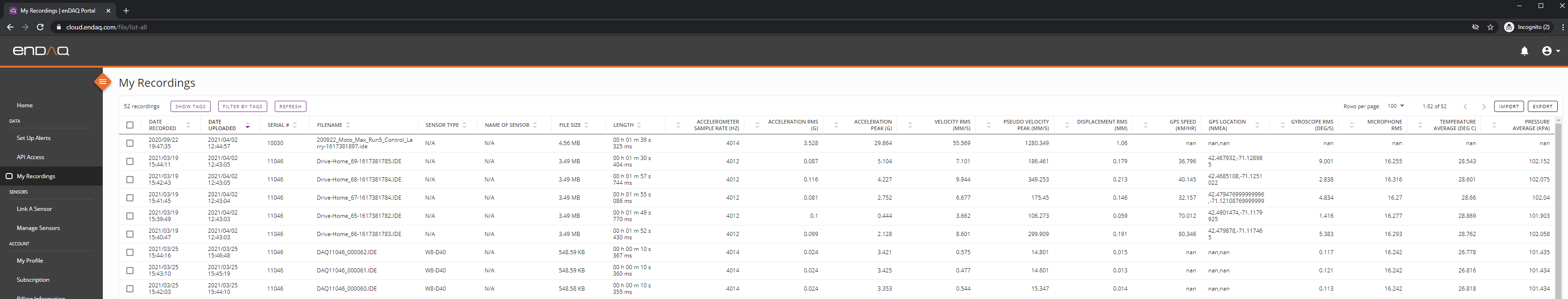
For now, these summary metrics are available in a table view that can be downloaded or accessed directly via the API. But dashboard generation is in development and should be released in June 2021.
Conclusion & Additional Resources
There is a LOT in here, so how can we summarize?
Well for starters, vibration analysis isn't a perfect science. It takes a bit of art to explore your data and find what matters most to your specific environment. And to start this you need:
- Vibration data - so get some sensors acquiring data!
- Summary metrics - vibration signals are complex, so quantify it into a handful of metrics
- Monitor those metrics - changes in these metrics will indicate change in the system
I went through 12 different vibration metrics, but if I had to pick my top 3 they would be:
- RMS acceleration
- RMS velocity
- High frequency (above 300 Hz) RMS acceleration
But start off by comparing all of these vibration metrics to find which one works best for your application. Go out and measure your own data and do your own analysis!
Please don’t hesitate to leave a comment or contact us directly with any questions you may have on this topic or others. We are here to help you with all your testing needs!
Related Posts:
- Top 9 Accurate Wireless Vibration Monitoring Systems
- Vibration Analysis: FFT, PSD, and Spectrogram Basics [Free Download]
- Why the Power Spectral Density (PSD) Is the Gold Standard of Vibration Analysis
For more on this topic, visit our dedicated Wireless Vibration Monitoring Systems resource page. There you’ll find more blog posts, case studies, webinars, software, and products focused on your condition monitoring and maintenance needs.