How to Preprocess Vibration Data for Machine Learning (Step-by-Step Guide)
Machine learning models are only as good as the data they are trained on—and raw vibration data often requires significant preprocessing.
Noise, inconsistencies, and irrelevant signals can reduce model accuracy if not handled properly.
Preprocessing helps clean and structure the data so models can detect meaningful patterns.
In this article, we walk through the key steps for preparing vibration data for machine learning applications.
Machine learning is a branch of artificial intelligence that enables computers to learn from data and make decisions without explicit programming. By applying machine learning models to large datasets, we can predict outcomes, identify trends, and uncover hidden insights.
The high frequency nature of vibration data can offer unique insights to inform machine learning systems. This is especially true when advanced analytics (FFT’s, PSD’s, Pseudo Velocity, etc.) are used to extract key features from vibration data.
These unique insights can range from system performance parameters to predictive maintenance capability. Another benefit of vibration data is that it is relatively inexpensive to acquire compared to ultrasonics, oil analysis and other sensing solutions that can offer predictive capability.
By using vibration data in conjunction with machine learning models, companies can predict failures before they happen, optimize manufacturing processes, and enhance product quality with a level of precision that wasn't possible before.

Fig. 1. Repair cost over time.
By the end of this blog, you will have a clear understanding of the necessary steps to prepare vibration sensor data for use in machine learning and be equipped with practical techniques to improve your model’s performance.
We will explore the key steps involved in preparing raw data acquired from vibration sensors for machine learning applications.
For the examples you see in this blog we used an enDAQ data logger to capture the vibration data, however, any high-performance vibration data logger will suffice. But before this raw data can be used to train machine learning models, it needs to undergo several preprocessing stages.
Proper data preparation ensures that the data is clean, accurate, and formatted in a way that maximizes the effectiveness of ML algorithms.
We will cover the following essential topics in this guide:
Testing machine and sensor type
As mentioned earlier, EnDAQ is capable of collecting a variety of data types, which are provided in the S and W series. For the analysis in this blog, an S series EnDAQ was mounted on a motor using double-sided tape, as shown in the figure below. Data was collected while the system ran for a period of time, and the results were saved on a local PC. Vibrations along the X, Y, and Z axes, with a sample rate of 4052.60 Hz, were measured and analyzed. Temperature data, sampled at 1.01 Hz, was also used just to demonstrate how resampling works.

Fig. 2. EnDAQ sensor mounted on a rotating system.
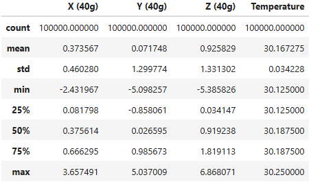
Which will return the table below:

It should be noted that vibration data along the X, Y, and Z axes are collected with a 40g accelerometer at 4000 Hz, and the 500g accelerometer at 20000 Hz. Since we are looking at low g, low frequency vibrations, we can just use the 40g accelerometer. The smaller data size will make these demo scripts execute more quickly.
The data is extracted and converted into a Pandas DataFrame for significantly easier handling. First, the acceleration channel is selected, and a Pandas DataFrame is created containing the acceleration values for all three axes:
The output will be the table below:

This process can be applied to convert each (or multiple) channel(s) into a Pandas DataFrame. Let's also apply it to the Temperature channel:
Where the output will be:
Resampling
As you may be aware, the number of acceleration data points (sample rate: 4000, number of datapoints: 1,362,231) does not match the number of temperature data points (sample rate:1, number of datapoints:338). This discrepancy is due to the different sample rates of each sensor. Specifically, if the number of data points recorded for one variable is fewer than that of another, the sample rate of the first variable will be lower. In such cases, which are common in sensor data, resampling techniques are used to align the data. If the sample rate needs to be increased, we perform upsampling, and if the sample rate needs to be decreased, we use downsampling.
Generally, upsampling is preferred over downsampling because downsampling can result in the loss of valuable data. In this case, we upsample the temperature data to match the sample rate of the acceleration data, ensuring that both datasets are aligned without losing information.

Note that EnDAQ provides a function for resampling endaq.calc.utils.resample(df, sample_rate=None). For more details, please refer to the EnDAQ documentation.
Data Visualization
Visualizing data is crucial for gaining preliminary insights. Various types of plots can be used to explore the data and identify patterns. For example, a time series plot can help visualize any increase or decrease in a variable over time. Both Matplotlib and Plotly can be used to plot variables over time. The key difference between the two is that Plotly offers interactive features, allowing users to zoom in, zoom out, and interact with the data more dynamically, while Matplotlib is more static.
In the subplot shown below, the first plot displays the changes in acceleration across the X, Y, and Z axes, while the second plot compares the resampled temperature data with the original temperature data.

Fig. 3. Visualizing changes in X, Y, and Z vibration (top) and temperature (bottom) plot.
For the sake of simplicity, a small portion of the data will be considered from now on, specifically the data between rows 500,000 and 600,000.

Data Analysis
Data analysis involves examining data to extract meaningful insights. This process can be performed using various techniques, such as plots, tables, and statistical parameters.
The temperature time series plot, for example, shows that running the rotating machine causes the temperature to increase over time. More specifically, the temperature rises slightly (from 28.5˚C to 30.5˚C) during the first 2 minutes, then it remains relatively constant for the next 4 minutes.
Histogram
Let's take a look at data histograms. Histograms can shed light on how data is distributed, or more simply, they show the range within which each parameter varies.

Fig. 4. Histograms of vibration acceleration for X, Y, and Z directions.
When plotting a histogram, the bars show the frequency of data points within specific ranges (bins). The Kernel Density Estimate (KDE) line (red solid lines in the plots), however, is a smoothed estimate of the distribution of the data, providing a continuous curve that helps visualize the underlying probability distribution more clearly. In histograms, the vertical axis represents density, while the horizontal axis represents the data magnitude.
Considering the plots, it can be observed that the majority of Y and Z acceleration values fall within the ranges of (-4, 4) g. The X acceleration is confined to a more limited range, roughly around (-1, 2).
Theoretically, a machine learning model trained on a specific dataset performs well within the ranges of that data, as it has learned patterns based on those values. However, any unseen data outside of that range is unfamiliar to the model, making it challenging for the model to perform accurately on such data.
Statistical metrics
Statistical metrics such as mean, standard deviation, minimum, 25th percentile, 50th percentile (median), 75th percentile, and maximum values can provide quick and valuable insights into the data.
Outlier
Removing outliers is a crucial step in data cleaning. An outlier is a data point that significantly deviates from other observations in a dataset, often lying far from the general trend or pattern. It may indicate variability or an anomaly in the data.
One of the simplest approaches for detecting outliers is using a boxplot. A boxplot identifies outliers based on the interquartile range (IQR). It displays the data's median, quartiles, and "whiskers" that extend up to 1.5 times the IQR from the quartiles. Data points outside this range, either above or below the whiskers, are considered outliers.

Fig. 5. Box plot showing outliers in X, Y and Z acceleration, and Temperature.
Other outlier detection methods include:
- Z-score: Identifies outliers by calculating how many standard deviations a data point is from the mean, flagging extreme values.
- IQR (Interquartile Range): Flags data points outside the range defined by 1.5 times the IQR above the third quartile or below the first quartile.
- Isolation Forest: A machine learning algorithm that isolates anomalies by recursively partitioning the data, with outliers being more easily separated.
- DBSCAN (Density-Based Spatial Clustering of Applications with Noise): A clustering method that detects outliers as points that do not belong to any cluster.
- Local Outlier Factor (LOF): Identifies outliers by comparing the local density of points, detecting those that are in regions of lower density than their neighbors.
Feature Selection
Feature selection is the process of selecting the most important features (variables) from a dataset to build a model, aiming to improve its performance, reduce overfitting, and decrease computational cost.
Pearson and Spearman correlation analysis can be part of feature selection. These methods measure the relationship between features:
- Pearson correlation evaluates the linear relationship between two continuous variables.
- Spearman correlation assesses the monotonic relationship, which can be either linear or non-linear.
ρX,Y = 1 - (6Σdi2)/n(n2-1) (Eq. 2)
where X and Y are parameters, n is the number of pairs of measurements, d is the difference of the ith pair of ranking.
Features with low correlation to the target variable might be discarded during the feature selection process to improve model performance. In correlation analysis, a value of 1 indicates a perfect positive relationship, 0 means there is no relationship, and -1 represents a perfect reverse relationship.
In our data, the highest positive correlation is observed between X acceleration and Z acceleration (0.31 for both Pearson and Spearman) which indicates that by increasing X acceleration, Z acceleration increases as well. On the other hand, the correlation coefficient between the X and Y accelerations is negative, meaning that as acceleration increases in one direction, acceleration in the other direction decreases. The correlation between vibration and temperature is negligible due to the low temperature variance in our data and the fact that we collected such a small sample of data for this example it would be difficult to determine any correlations.
Pearson correlation:
Spearman correlation:


Fig. 6. Pearson (top) and Spearman (bottom) coefficients for X, Y, Z, and temperature.
Other feature selection methods include:
- Chi-Square Test: Assesses the independence of categorical features by comparing observed and expected frequencies.
- Mutual Information: Measures the amount of information shared between two variables, capturing both linear and non-linear relationships.
- Recursive Feature Elimination (RFE): Iteratively removes the least important features based on model performance to improve accuracy.
- L1 Regularization (Lasso): Uses L1 regularization to shrink coefficients of less important features to zero, effectively performing feature selection.
- ANOVA F-test: Compares the variances within groups for each feature and selects those that show significant differences.
- Tree-based methods (e.g., Random Forest): Uses decision tree algorithms to rank features based on their importance in predicting the target variable.
Filtering Data to Remove Noise
Noise removal methods aim to reduce random fluctuations or errors in data. Common methods include moving average, Median filters, Savitzky-Golay Filter, Wavelet Transform, Exponential Moving Average (EMA), and Gaussian smoothing. EnDAQ offers a Butterworth filter through the function endaq.calc.filters.butterworth, which is explained in detail here. Among these, the moving average is one of the most common due to its simplicity and effectiveness in smoothing time-series data.
The Moving Average (MA) method smooths time-series data by averaging data points within a specified window, typically a fixed number of neighboring values. It reduces noise by dampening short-term fluctuations, making long-term trends clearer.

Fig. 7. Original and filtered vibrations of X, Y, and Z directions using Moving Average method.

Fig. 8. Original and filtered vibrations of X, Y, and Z directions using Moving Average method (Zoomed-in).
You might be wondering, "Why don't we define a threshold for noise removal?" Defining a threshold for noise removal can be also effective, especially when the noise has high amplitude or is easily distinguishable from the signal. It involves setting a cutoff value, and any data points exceeding this threshold are removed or altered. While simple, this method may lead to data loss if the threshold is too strict, or the noise is subtle. It works best when noise is clearly separated from the signal, but it may not be suitable for all types of noise, especially low-amplitude or similar-frequency noise. Combining thresholding with other techniques can improve results.
There can be confusion between noise and outliers, as they are related but not the same. Noise refers to random, unpredictable variations or errors in the data that can obscure the true signal, while outliers are experiment results that differ significantly from the mean, often indicating a large deviation from the general trend or pattern. Outliers can be considered a form of noise when they result from errors or anomalies in data collection, but not all noise consists of outliers. Noise can be more subtle and may not always manifest as extreme values.

Fig. 9. Difference between outlier and noise.
FFT analysis – Key Features From Vibration
As mentioned previously, vibration data can offer unique system insights. One of the primary methods for extracting these key insights is by using the Fast Fourier Transform (FFT). FFT is an algorithm used to compute the Discrete Fourier Transform (DFT) efficiently, converting a time-domain signal into its frequency-domain representation. It breaks down a signal into its constituent frequencies, making it useful for analyzing periodic components and identifying noise or trends in data. For additional information, check out the blog on Vibration Analysis: Fourier Transform, Power Spectral Density, and Aggregate FFT.
Key parameters of FFT include:
- Sampling Rate (fs): The rate at which the signal is sampled, affecting the frequency resolution and range.
- Window Size (N): The number of data points used in the FFT; a larger window gives better frequency resolution.
- Frequency Resolution: Determined by fs/N, it defines the smallest frequency difference that can be detected.
- Frequency Range: The highest detectable frequency is fs/2 (Nyquist frequency), and the lowest is determined by the signal length.
FFT is widely used in signal processing, audio analysis, and noise removal.
In signal processing, the following techniques are used to improve the analysis of signals, especially in FFT and spectral analysis:
- Windowing: This technique applies a window function (e.g., Hamming, Hanning, or Blackman-Harris) to a segment of the signal before applying the FFT. Windowing reduces spectral leakage by tapering the signal at the boundaries, which minimizes discontinuities. The window function helps isolate a portion of the signal and reduces distortion caused by abrupt edges.
- Averaging: Averaging involves computing the FFT of multiple segments of a signal and then averaging the results. This reduces variance and noise in the frequency domain, resulting in a smoother and more reliable spectrum. Techniques like power spectral averaging are commonly used to enhance the accuracy of frequency analysis, particularly when dealing with noisy signals.
- Overlapping: In this method, successive segments of the signal overlap, typically by 50% or more. This ensures that the entire signal is analyzed while minimizing the loss of information at the segment boundaries. Overlapping is often combined with windowing to provide continuous, high-resolution analysis of signals, especially in real-time processing or when dealing with time-varying signals.
Together, these techniques improve the accuracy and quality of frequency-domain analysis, particularly for noisy or complex signals.
Let’s apply the FFT to the X, Y, and Z acceleration data:

Fig. 10. FFT results on acceleration of X, Y, and Z directions.
Note that EnDAQ provides a function for performing analysis using endaq.calc.fft.aggregate_fft(df, **kwargs). For more details, please refer to the EnDAQ 1.5.3 documentation.
The following information can be derived from FFT:
- The highest peak in the FFT represents the dominant frequency in the signal. This frequency corresponds to the main oscillation or periodic component of the data. In practical terms, it indicates the primary frequency at which the system or signal is vibrating or oscillating. The amplitude of this peak shows the strength or intensity of that frequency. A higher peak means that the signal contains a stronger component at that frequency.
- Harmonics are integer multiples of the fundamental frequency (the frequency of the highest peak). If the fundamental frequency is f0, the first harmonic is at 2f0, the second harmonic is at 3f0, and so on. Harmonics occur when the system is nonlinear, or when there is a periodic signal with more than one frequency component. In the case of vibrations, harmonics often appear when there are mechanical resonances or distortions in the system. The presence and amplitude of harmonics provide information about the complexity or the nature of the system's behavior. Significant harmonics can indicate non-ideal or nonlinear behavior in the system, such as mechanical faults (e.g., imbalance, misalignment) or resonances.
- Structural Resonances can appear in the data and indicate where the natural frequencies of the structure. These natural frequencies can be influenced by the systems boundary conditions and other factors such as: loosening bolts, material loss due to corrosion, added mass due to ice build up and the like.
- Noise can appear as smaller peaks throughout the FFT result, and these may not represent significant frequency components. Filtering or windowing techniques can help mitigate noise effects. Spurious peaks can occur due to artifacts in the data, such as poor sampling or non-periodic noise. It's important to distinguish between real frequency components and these artifacts.
To extract meaningful features from FFT results for machine learning (ML), a peak-finding routine is essential. This routine identifies dominant peaks in the frequency spectrum, which represent the primary frequencies present in the signal. Algorithms like find_peaks in Python can help detect these local maximums efficiently.
Let's find the FFT peak of acceleration in Y direction:
As displayed in Figure 11, the FFT peak is detected by find_peaks function:

Fig. 11. Finding FFT peak for Y acceleration.
Once the peaks are identified, key features such as frequency, amplitude, peak width, and peak power can be extracted. These features are valuable for creating feature vectors, which serve as structured representations of the signal’s characteristics that ML models can use for further analysis.
These extracted features can be fed into ML models for tasks like classification or anomaly detection. By converting raw FFT data into structured features, the machine learning algorithm can better predict system behavior, detect faults, or identify patterns in the signal.
Summary
In this blog, we covered the essential steps for preparing vibration sensor data for machine learning, providing practical techniques to improve model performance.
We explored key topics including tools and libraries, reading and converting data formats, resampling, data visualization, and analysis (such as histograms, statistical metrics, and outlier detection).
Additionally, we discussed feature selection, noise filtering, and the application of FFT analysis to extract meaningful insights from the vibration data.
By following these steps, you'll be well-equipped to handle vibration sensor data and apply it effectively in machine learning projects.
Key Takeaways
- Raw vibration data often contains noise and inconsistencies
- Preprocessing improves model accuracy
- Includes filtering, normalization, and segmentation
- Critical for reliable anomaly detection and predictions
FAQ
Why is preprocessing important for vibration data?
It removes noise and improves the quality of data used in models.
What are common preprocessing steps?
Filtering, normalization, and segmentation.
Can machine learning work without preprocessing?
It can, but results are usually inaccurate or unreliable.
In the upcoming blog, we will demonstrate how vibration data and FFT can be utilized for anomaly detection and fault classification.

Resources, Scripts & Files